A Pivot Table within the Cnfans spreadsheet is a dynamic reporting tool that allows you to rapidly summarize, analyze, and group large amounts of haul data without writing a single formula. By using a Pivot Table, you can instantly transform rows of item details into a consolidated report, such as calculating total spending per category or analyzing shipping costs by weight. The basic process involves organizing your item data into a clean table, selecting the "Insert Pivot Table" option, and then dragging and dropping data fields like 'Category' and 'Price' into designated areas to build your analysis.

Table of Contents
- What is a Pivot Table and Why Use It for Your Hauls?
- Preparing Your Haul Data for Analysis
- Creating Your First Haul Analysis Pivot Table
- Practical Haul Analysis Scenarios
- Advanced Pivot Table Techniques for Power Users
- Visualizing Your Haul Data with PivotCharts
- Maintaining and Refreshing Your Pivot Table
- Common Issues and Troubleshooting Steps
- Why the Cnfans Spreadsheet is the Ultimate Tool for Haul Management
What is a Pivot Table and Why Use It for Your Hauls?
Imagine your Cnfans spreadsheet contains hundreds of items from your various shopping hauls. Answering simple questions like "How much did I spend on shoes this year?" or "What's the average weight of my clothing items?" would require manual sorting, filtering, and complex formulas. A Pivot Table automates this entire process. It’s an interactive summary table that extracts significance from a large, detailed dataset, such as your haul list.
For CNFans users, the benefits are immediate and substantial. You can instantly pivot your data to see a high-level summary of your spending habits. Instead of scrolling through endless rows, a Pivot Table can present a neat report showing total expenditure broken down by categories like 'Tops', 'Pants', 'Accessories', and 'Shoes'. This capability transforms your spreadsheet from a simple list into a powerful budgeting and analysis tool, helping you make smarter purchasing decisions for future hauls.
Preparing Your Haul Data for Analysis
The quality of your Pivot Table report depends entirely on the quality of your source data. Before you can create a meaningful analysis, your haul information must be organized in a structured, tabular format. This preparation is the most critical step for ensuring accurate results.
Ensuring Clean and Structured Data
Your data should be arranged like a database table. Each row must represent a single item, and each column must represent a specific attribute of that item (e.g., Name, Price, Weight). Follow these fundamental rules for clean data:
- No Blank Rows or Columns: Ensure there are no entirely empty rows or columns within your data range. This can cause the Pivot Table to misinterpret the boundaries of your dataset.
- Unique Column Headers: Every column must have a distinct, descriptive header in the first row. Headers like 'Item Name', 'Price (CNY)', and 'Weight (g)' are essential.
- Consistent Data Formatting: Keep the data type consistent within each column. A 'Price' column should only contain numbers, and a 'Date' column should only contain dates. Avoid mixing text and numbers in the same column where calculations will be performed.
- Avoid Merged Cells: Merged cells are a common source of errors for Pivot Tables. Ensure all merged cells within your data area are unmerged before you begin.
Essential Data Columns for Haul Analysis
To get the most out of your haul analysis, your Cnfans spreadsheet should include several key columns. A well-structured table might look like this:
| Item Name | Category | Store/Seller | Price (CNY) | Weight (g) | Domestic Shipping (CNY) | Purchase Date |
|---|---|---|---|---|---|---|
| Vintage Graphic Tee | Tops | Super Tees | 89 | 250 | 10 | 2025-01-15 |
| Cargo Pants | Pants | StreetStyle Co. | 150 | 600 | 12 | 2025-01-16 |
| Silver Chain | Accessories | JewelCraft | 55 | 50 | 8 | 2025-01-18 |
Having these columns allows you to analyze spending by Category, compare quality from different Stores, and calculate the total Weight of your haul, which is crucial for estimating international shipping costs.
Creating Your First Haul Analysis Pivot Table
Once your data is clean and structured, creating a Pivot Table is a straightforward process. This is where you begin to unlock the analytical power of your haul data.
Step-by-Step Insertion Process
Follow these steps to generate your first report:
- Click any single cell inside your data table. You do not need to select the entire table; the spreadsheet software will automatically detect the data range as long as it's properly structured.
- Navigate to the Insert tab on the top ribbon.
- Click on the PivotTable button. A dialog box will appear.
- The dialog box typically confirms the data range it has detected and asks where you want to place the new Pivot Table (a new worksheet is usually the best option for clarity).
- Click OK. A new worksheet will be created with a PivotTable placeholder on the left and the PivotTable Fields pane on the right.
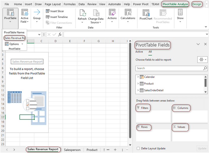
Understanding the PivotTable Fields Pane
The PivotTable Fields pane is your control center. It contains a list of all your column headers (fields) and four areas where you can place them to build your report:
- Filters: Place fields here to apply a high-level filter to your entire report. For example, you could filter by 'Purchase Date' to see only items from a specific month.
- Columns: Fields placed here will create columns across the top of your Pivot Table. This is useful for comparing data side-by-side, but is often used less than the Rows area.
- Rows: This is where you will drag the fields you want to group and analyze. For haul analysis, dragging the 'Category' field here will create a unique row for each item category (e.g., Tops, Pants, Shoes).
- Values: This area is for fields you want to calculate. Typically, you will drag numerical fields like 'Price (CNY)' or 'Weight (g)' here. The Pivot Table will automatically sum them up, but you can change the calculation to an average, count, max, or min.
Practical Haul Analysis Scenarios
With your Pivot Table set up, you can now answer specific questions about your shopping hauls. The true power of this tool is revealed through practical application.
How to Calculate Total Spending by Item Category
This is one of the most common and useful analyses for any shopper. To build this report:
- Drag the 'Category' field from the field list into the Rows area. Your Pivot Table will now show a list of all your unique item categories.
- Drag the 'Price (CNY)' field into the Values area.
Instantly, the Pivot Table calculates and displays the sum of prices for all items within each category. You now have a clear, concise report showing exactly where your money is going, allowing you to see if you are overspending on certain types of items.
Analyzing Item Weight vs. Cost
Shipping costs are a major factor in international hauls. Understanding the weight distribution of your items is key to managing your budget. To create this analysis:
- Ensure 'Category' is still in the Rows area.
- Drag 'Price (CNY)' to the Values area (it should default to 'Sum of Price').
- Drag 'Weight (g)' to the Values area as well. It will appear as 'Sum of Weight'.
- Optional: To find the average weight per category, click on 'Sum of Weight' in the Values area, select 'Value Field Settings', and change the calculation from 'Sum' to 'Average'.
This report allows you to see which categories contribute most to your haul's total weight. You might discover that while shoes are expensive, hoodies and jackets are disproportionately heavy, significantly increasing your shipping fees.
Comparing Spending Across Different Stores or Sellers
Curious about which sellers you buy from the most? A Pivot Table makes this comparison easy.
- Drag the 'Store/Seller' field into the Rows area.
- Drag the 'Price (CNY)' field into the Values area.
- To see how many items you bought from each store, drag the 'Item Name' field into the Values area. It will default to 'Count of Item Name', showing you the item count per seller.
This analysis helps you identify your favorite stores and can be a starting point for evaluating which sellers offer the best value or quality over time.
Advanced Pivot Table Techniques for Power Users
Once you've mastered the basics, you can leverage more advanced features to create sophisticated and interactive dashboards for your haul management.
What Are Slicers and How Do They Create Interactive Dashboards?
Slicers are user-friendly filter buttons that make it easy to filter your Pivot Table data. Instead of using the clunky drop-down menu in the Filters area, Slicers provide a more visual and intuitive way to interact with your report.
To add a Slicer, click anywhere inside your Pivot Table, go to the PivotTable Analyze tab, and click Insert Slicer. A dialog box will appear, letting you choose which field you want to create a slicer for (e.g., 'Category', 'Store/Seller'). Once created, you can simply click the buttons on the Slicer to filter your Pivot Table dynamically. Connecting multiple Slicers allows you to build a fully interactive dashboard to explore your haul data from various angles.
Using Calculated Fields for Deeper Insights
What if you want to calculate a value that doesn't exist in your source data, such as a 'Landed Cost' (Item Price + Domestic Shipping)? This is where Calculated Fields come in.
From the PivotTable Analyze tab, go to Fields, Items, & Sets and select Calculated Field. In the dialog box, you can name your new field (e.g., 'Total Item Cost') and enter a formula using your existing fields, such as ='Price (CNY)' + 'Domestic Shipping (CNY)'. This new calculated field will become available in your PivotTable Fields list and can be used in the Values area just like any other field, enabling more complex financial analysis without altering your original data.
Grouping Data to Analyze Trends
The grouping feature allows you to consolidate data within a field. For example, you can group a 'Purchase Date' field by months, quarters, or years to analyze spending trends over time. You can also group numerical data, such as item prices. To do this, right-click a cell in the row or column you want to group, select Group, and define the grouping parameters (e.g., group prices in increments of 50 CNY). This helps you see how many items you bought within certain price brackets (e.g., 0-49, 50-99, 100-149).
Visualizing Your Haul Data with PivotCharts
A PivotChart is a chart that is directly linked to your Pivot Table. When you filter or change the structure of your Pivot Table, the PivotChart updates automatically, making it an excellent tool for visual data representation.
To create one, simply click inside your Pivot Table and select PivotChart from the PivotTable Analyze tab. You can choose from various chart types like bar, pie, or line charts. For example, a pie chart is perfect for visualizing spending distribution by category, while a bar chart is great for comparing the total weight contributed by different item types. This visual element makes your findings more impactful and easier to understand at a glance.
Maintaining and Refreshing Your Pivot Table
Your Pivot Table is a snapshot of your data at the time of its creation. If you add new items to your source data table, the Pivot Table will not update automatically. To include the new data, you must perform a refresh.
Right-click anywhere inside your Pivot Table and select Refresh. This will update all calculations based on the current data in your source range. If you've added new rows or columns outside the original range, you may need to update the data source. To do this, go to the PivotTable Analyze tab, click Change Data Source, and select the new, expanded data range.
Common Issues and Troubleshooting Steps
Even seasoned users encounter issues. Here are some common problems and their solutions:
- Fields Not Grouping Correctly: This often happens when there are inconsistencies in your data. For instance, 'Tops' and 'tops' will be treated as two separate categories. Ensure your data is standardized.
- Refresh Not Capturing New Rows: This usually means your new data was added outside the Pivot Table's original data source range. The best practice is to format your source data as a formal Table (Insert > Table) before creating the Pivot Table. Tables automatically expand to include new rows, so a simple refresh will always capture all your data.
- Incorrect Calculations: If a price field is being counted instead of summed, it's likely because the column contains some text or blank cells, forcing the Pivot Table to treat the entire column as non-numeric. Check your source data for errors in the problematic column.
Why the Cnfans Spreadsheet is the Ultimate Tool for Haul Management
While any spreadsheet program can create Pivot Tables, the Cnfans spreadsheet is purpose-built for the very data you're analyzing. It streamlines the entire process, from item entry to advanced analysis. Its features, such as automatic currency conversion and integrated shipping estimators, ensure your source data is already clean, accurate, and ready for pivoting from the moment you add an item.
By leveraging the powerful Pivot Table functions directly within a tool designed for your shopping journey, you're not just organizing items—you're creating a comprehensive financial command center. The Cnfans spreadsheet provides the perfect foundation, making the advanced analysis techniques discussed here not just possible, but effortless. It transforms the complex task of international haul management into a simple, data-driven experience, empowering you to budget smarter and build better hauls.